Putting spend management on mobile to lift customer spend
Impact
Fewer support tickets on the gaps we closed, with higher card spend and fewer out-of-pocket reimbursements.
Context
Divvy is a financial management platform that combines corporate credit cards with software for real-time expense tracking. It offers enhanced control over budgets and integrates with accounting systems for streamlined financial operations.
Problem
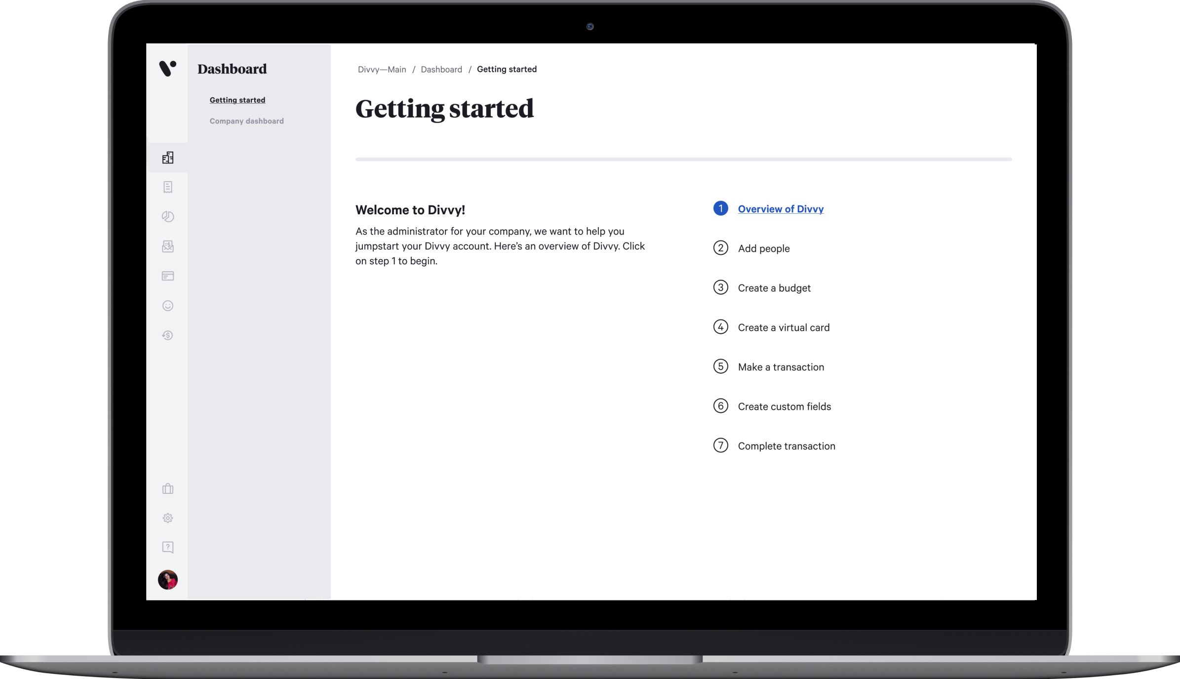
Divvy's mobile app trailed the web app on the everyday work of managing a team. An admin who was traveling or between meetings couldn't add a team member or assign a corporate card without getting to a desktop, so new hires fell back on personal cards and waited on reimbursement. The job was to bring people and card management to mobile and close the gap with web.
Team
- Product Manager
- Product Designer (me)
- Dev Lead
- Back-End Developers (2)
- Front-End Developers (2)
- Mobile Developer
Mapping what mobile was missing
I started by auditing the web app and mapping it against mobile. The mobile app was missing the entire people-and-cards surface, with no people list, no person details, no way to edit a person, and no add-person flow. I mapped the People feature end to end so the team could see exactly what parity would take and where to start.
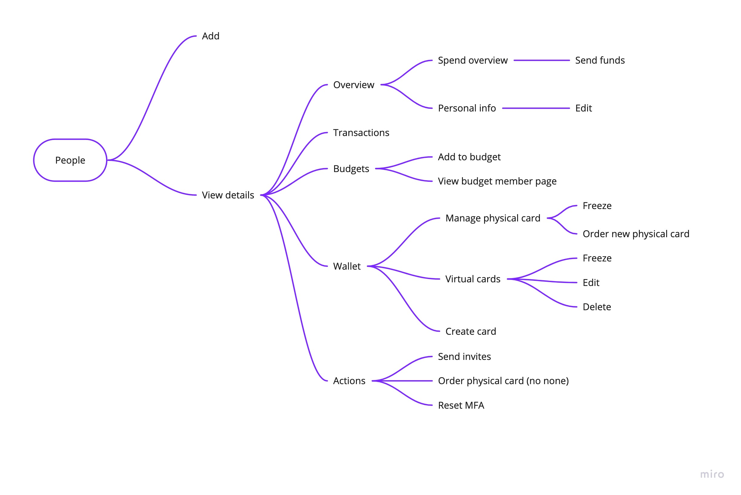
Designing for parity, in phases
Rather than port the web app screen for screen, I designed the full mobile experience up front, a sitemap and wireframes I iterated on with customers and stakeholders and tested with users. Then I sequenced delivery into phases so value shipped early and the build could absorb shifting priorities:
- A people list and a basic person detail page first.
- A lightweight add-person flow next, the piece admins needed most.
- Expanded person details to reach full parity with web.
- The complete add-person flow, with budget assignment and both virtual and physical card provisioning.
I built every screen on Divvy's design system, so the new surface shipped consistent with the rest of the product.
Shipping around constraints
Engineering resources were tight, so we shipped the phases out of sequence. Phase three started before phase two, which we finished once resources freed up, and phase one launched without a major bug. User testing ran through every phase, so each release improved on real feedback rather than assumptions.
Impact
Once the gaps were closed, support saw a clear drop in tickets about the very things we set out to fix. The new mobile capabilities also moved the business in the right direction, with a lift in card spend and fewer out-of-pocket reimbursements as people stopped falling back on personal cards.
What I took away
Designing for parity turned out to be about sequencing, not just screens. Phasing the work let the most-needed piece ship first and gave the plan room to bend when engineering capacity shifted. And the gap that looked like a few missing screens was really about one thing, letting people run their teams from wherever they were.
Continue exploring
Building Divvy's onboarding from scratch to 95% engagement
2019