Building Divvy's onboarding from scratch to 95% engagement
Impact
95% onboarding engagement, with a 5% lift in customer spend in the first month.
Context
Divvy is a financial management platform that combines corporate credit cards with software for real-time expense tracking. It offers enhanced control over budgets and integrates with accounting systems for streamlined financial operations.
Problem
Getting started with Divvy had no in-product onboarding. New customers were guided by hand, walked through by client-management staff, and pointed to a few PDFs, which didn't scale and left activation uneven. The job was to build a guided experience from scratch, inside the product.
Team
- Product Manager
- Product Designer (me)
- Dev Lead
- Back-End Developers (2)
- Front-End Developers (2)
- Mobile Developer
Working within the constraints
The deadline was two months, with no room for fresh user interviews, so rather than start research from zero I mined what the company already knew, from support tickets to the firsthand experience of the client-management team who onboarded customers by hand every day.
That pointed straight at the goal, to shorten the path from first login to first transaction, so new users hit value before they gave up.
Building on a system that couldn't talk back
I explored several onboarding patterns and chose a dedicated Getting Started page shown at first login, with digestible, self-paced steps that walked a new customer all the way to their first transaction.
The hard part was technical. We built the steps in Pendo, which the team already used for walkthroughs. But Pendo and the Divvy product couldn't communicate, so the page had no reliable way to know what a user had actually completed. Rather than rebuild the integration on a two-month clock, I designed around the gap, using cues like delayed task-completion indicators to keep progress feeling accurate and in sync across both systems.
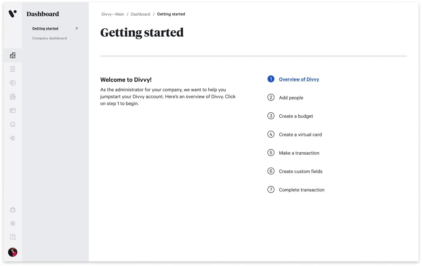
Designing the states
Onboarding lives in its in-between states, so I designed the whole arc, covering the zero state, partial progress with a clear next step, the completed-and-celebrated state, a graceful way to dismiss it, and the edge cases for when a step couldn't be marked done.
Impact
The onboarding reached a 95% engagement rate, with a 5% lift in customer spend in the first month after onboarding.
The demand was clear enough that the support team asked to turn it on for existing and long-standing customers too, which became a new capability. Internal teams could reactivate the guide for any account, reaching people who'd dismissed it or joined before it shipped.
What I took away
The constraint that looked like a blocker, a tool that couldn't report progress, turned into the most interesting part of the design. Building from scratch on a tight timeline rewards using the knowledge already in the building and designing around the system you have, rather than waiting for the one you wish you had.
Continue exploring
Reviving a stalled design system — and making the case to scale it
2025–2026