Product Design · MX · 2025–2026
Reviving a stalled design system to win leadership priority for a $47B mobile opportunity
Context
MX powers financial experiences like account aggregation, money management, insights, dashboards, and connectivity widgets, embedded across banks and credit unions and used by millions. MX's design system, MXUI, is built on MUI with a theme wrapper that carries MX's brand.
Problem
MX's design system was stalled. The team that had built the original in-house component library was gone, and the move to an MUI-based system had lost momentum — with no dedicated owner, no plan, and no priority. A year in, only about a third of the code had migrated, and legacy components were still shipping in products years later.
Impact
I took ownership of MX's stalled design system and rebuilt its structure and Figma foundation on MUI. I reframed it from a quality initiative into the engine for MX's scalable mobile vision, pointing to the $47B white-label banking apps market projected by 2034 as the opportunity at stake. That case won the leadership prioritization the system had been missing. I'm now shipping the component migration in code myself, writing MRs directly into the codebase to keep design and production in parity.
Team
I worked on this as a passion project, part-time, with two front-end engineers. I functioned as the designer and an unofficial PM, with mentorship from my manager.
Context & stakes
Every client can theme MX's products to their own brand, and the same experiences span both web and mobile — from account aggregation and money management to dashboards and connectivity widgets, used by millions.
That makes a shared, consistent UI system not a nicety but the only way to ship branded, accessible products at scale without rebuilding them for every client. MXUI is built on MUI (Material UI) with a theme wrapper that carries MX's look and feel.
The challenge
When I took it on, the system was stalled. The team that had built MX's original in-house component library was gone, and the move to an MUI-based system had lost momentum. A few front-end engineers contributed on the side, but there was no dedicated owner, no plan, and no priority.
The contribution model wasn't holding. Under delivery pressure, design-system work was the first thing cut, along with tech debt, design debt, and even QA. A year in, only about a third of the code had migrated, and components from the old, unmaintained system were still shipping in products three-plus years later.
Meanwhile the stakes were rising. The mobile team was rebuilding the app and wanted it to scale, but every client still got a custom build, and the embedded web widgets and the native mobile UI didn't speak the same visual language.
Taking ownership
My design-systems experience was why they handed it to me, and the first job was simply to give the effort a backbone. I stepped in as the de facto lead and PM for a scrappy, cross-functional group, running weekly working sessions, standing up a Jira board, and documenting decisions so the work had structure and memory instead of living in one recurring meeting.
Restructuring the system
Then I restructured the system itself around a few decisions:
- Lean on the framework, not against it. Wherever MUI's defaults were good enough, we used them rather than maintain custom equivalents, leaning on its color-token system, its components, and even interaction details like button ripple. We kept MX's look and feel through theming and built only the few custom components MUI couldn't cover.
- Rebuild the source of truth. I rebuilt the entire system in Figma on a MUI template, themed to match MX's existing design language, so design and code finally shared one foundation.
- Make the gap visible. I audited what had actually been customized in code versus what hadn't, and turned the differences into a tracked backlog.
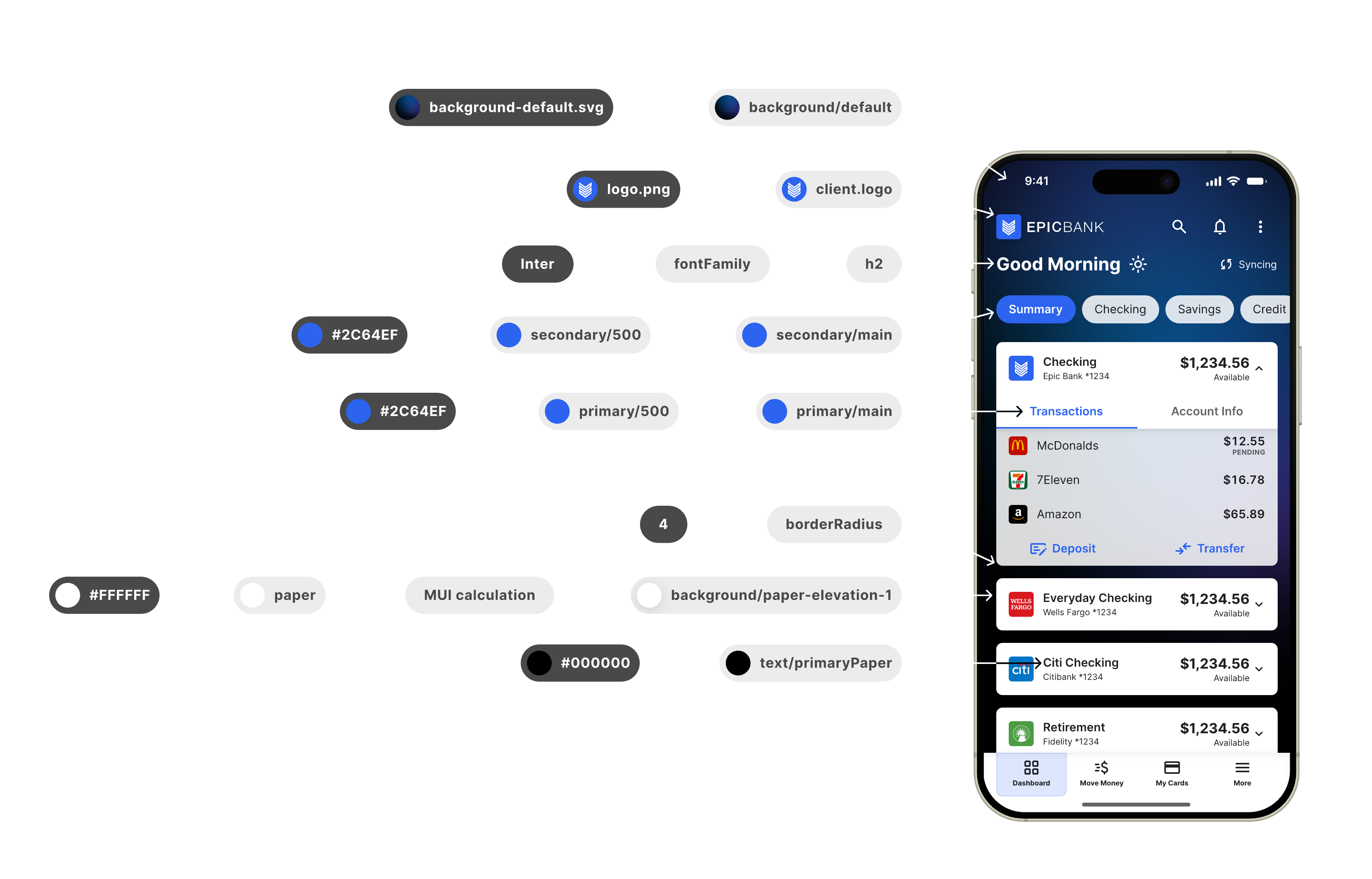
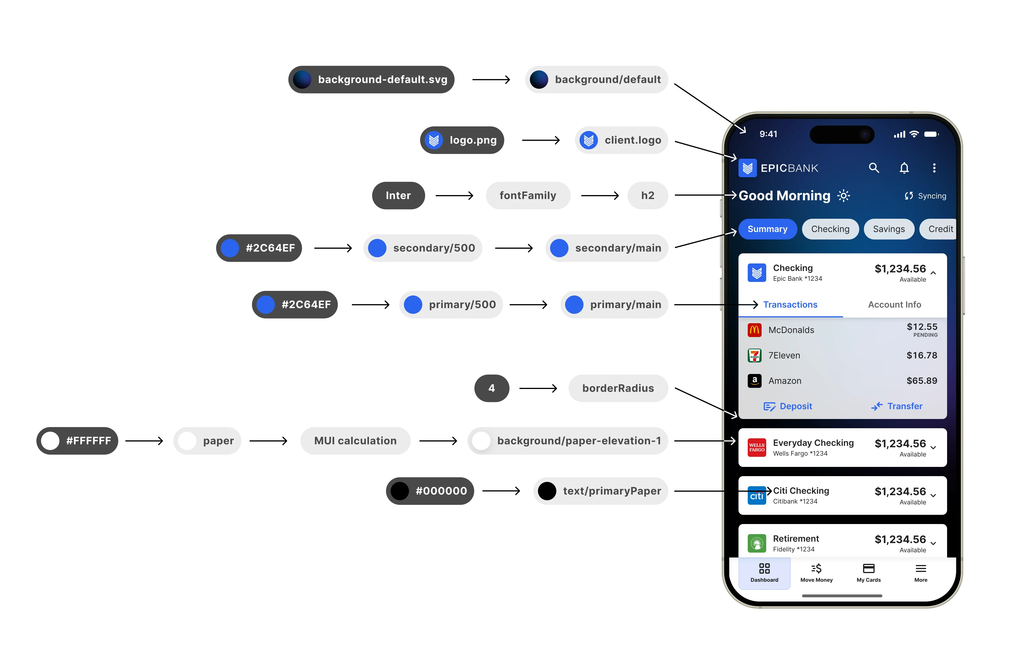
The throughline was tokens. Treating color, type, and radius as named tokens, a single source of truth, means a change in one place cascades across every component, platform, and theme.
Making the case
None of it mattered without priority, and priority was the hard part. Pitching the system on its own merits (accessibility, velocity, and consistency) hadn't moved leadership; those are easy to nod at and defer.
So I reframed it. The mobile rebuild's entire vision depended on scalable theming, and because the mobile app embeds MX's web widgets, the two have to speak the same theming language. A tokenized system is what makes that possible. Define a client's theme once, and it flows across every product and surface. I made the design system the means to an outcome leadership already wanted, not a virtue to be admired.
And I didn't just write it up. I built the case as something leadership could see and react to, with the stakes, the architecture, and the path, plus a working proof of concept of how easily themes could be swapped, supporting mockups, and a prototype of a longer-term portal where clients could customize their own theme. I presented it, and the work became a priority.
Shipping it
There was an important limit to the mandate. Teams were required to migrate onto MXUI, to stop using the legacy system, but not to make every component match the Figma designs. In practice they pull in MUI's defaults carrying our colors, radii, and typography styles through tokens, which is enough to count as “on MXUI.” But without the engineering time to refine components to spec, products drift toward a default look and away from MX's full brand and feel.
Closing that gap is the part I took on directly. With no dedicated engineers for it, I started writing the code myself, merging pull requests to bring components up to the Figma source of truth, both net-new and customized ones, week by week.
Designing the system and then implementing it in code keeps the foundation honest. The Figma library and the shipped components stay in lockstep, and I catch the gaps that only show up once a component is real.
Where it stands
The headline outcome isn't a metric yet. It's a mandate. An effort that had no owner, no plan, and no priority is now a leadership-backed initiative with a clear architecture, a tracked path, and a migration moving in code.
And it compounds. The system underpins MX's product suite of web and mobile experiences used by 9–13M+ people monthly, across a product organization of 9 designers and about 50 front-end engineers, so every component migrated and every product adopted widens the impact.
What I took away
The biggest lesson, for me, was the importance of creating a vision. I didn't sell leadership on the design system. I sold them on what it would get them, tied to an outcome they already wanted. And I didn't just tell them; I showed them, with a working proof of concept and a prototype they could try for themselves.
I also learned how to lead without authority or resources. Bring order first with a board, a cadence, and documentation, then make the gaps visible and keep shipping, even when that means writing the code yourself.